About
Nandini is a very well known brand in Karnataka. Karnataka Milk Federation(KMF) is the second-largest milk producing cooperative in the country. It distributes approximately 3 lakh litres of milk in a variety of forms, such as milk sweets, chocolates, curds, fermented items, and so on. The co-operative has already completed 35+ years in the milk-producing industry.
Brief
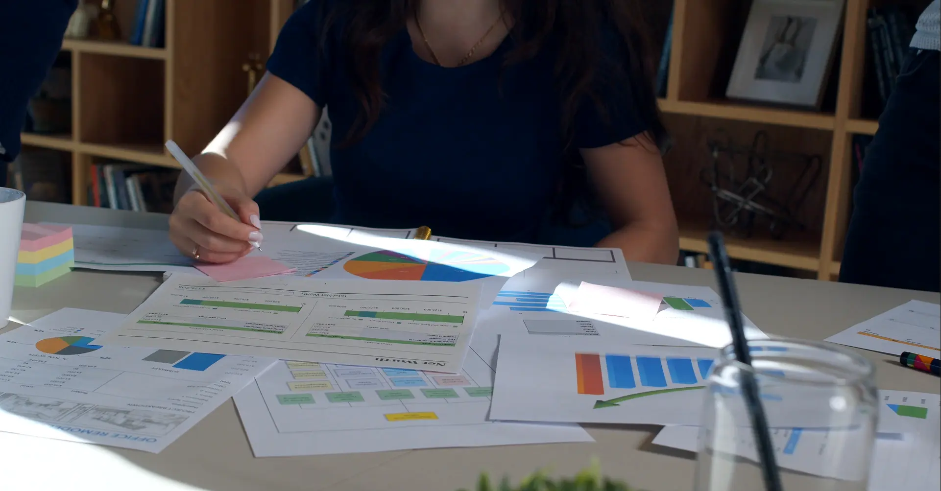
- The DKMUL team's top priority was to conduct a thorough survey of their dealers' information and opinions on the system.
- This had to be digitally captured in software that had to be custom-built by our team to meet the DKMUL team's specifications.
- The software had to cover certain personal facts, addresses, mapping, and a variety of other information elements.
- This has to be developed using our Surway Analytics software and in a short period of time.
Approach
The DKMUL team had a lot of data from their everyday transactions with over 100 dealers, franchisees, and other businesses. However, there was no structure to it, and it was hard to access. We were tasked with developing a system for collecting, aggregating, and storing data.
As the company had a hierarchy of individuals working at various levels, we wanted to design the software in such a way that it assisted everyone in getting their work done quickly.
These were some key areas where we focused
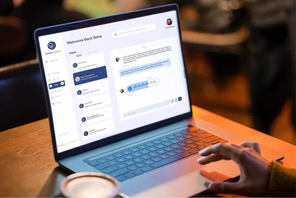
- Create a interface for members to collect data easily and store it in a structured related manner
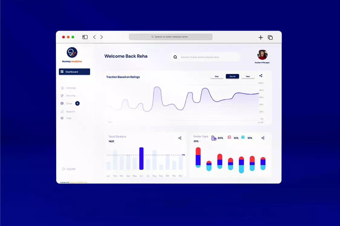
- Report the collected data in form of charts and graphs and use analytic tools to gain relevant insights from it
- Create a dashboard with relevant features that are helpful for individuals at all levels in the organization.
We started off by gathering requirements and split the problem into various modules. A mobile friendly web interface was created that resembled a form to add questions and other input fields. These would later be filled by the team to collect the relevant information required. A provision to update data easily from time to time was also added.
While creating the UX of the system, we wanted to simplify the user experience with the dashboard and hence used familiar UI elements seen in Android or Windows systems.
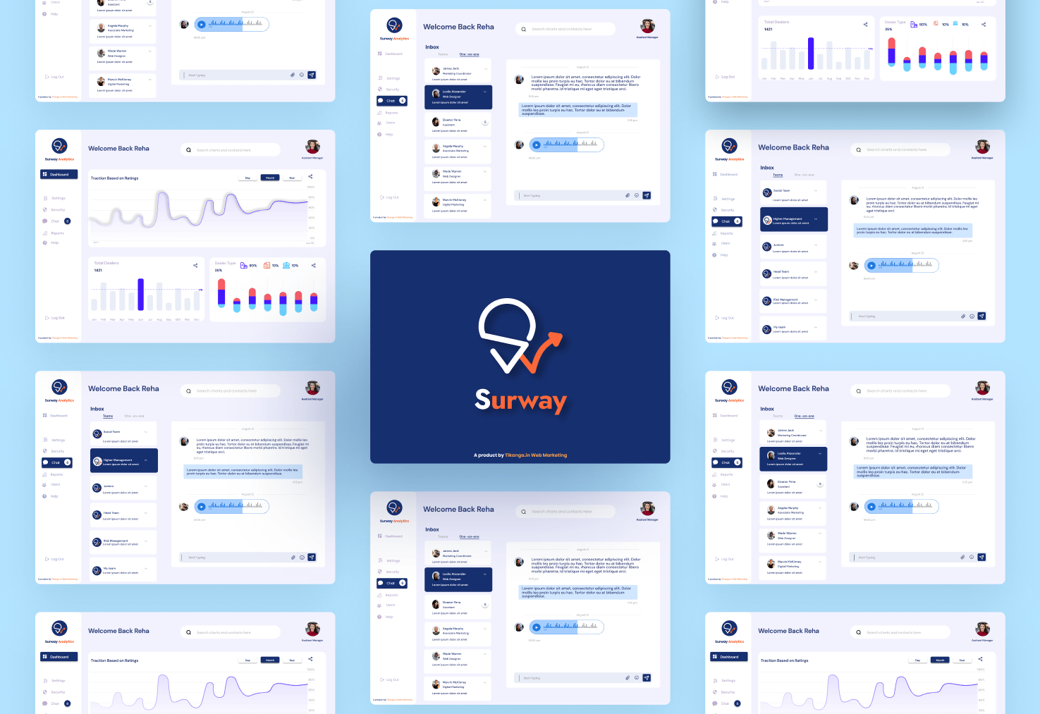
PWA technology and server-side rendering was used to optimize the speed of the app and also the load time. Beautiful charts and graphs from chart.js were added that made the system more pleasing to the eye.
Along with this a physical copy of the report was generated along with a user manual of the dashboard interface. The report contained the key insights and relevant info that was at the teams disposal at any time. The manual helped the team easily navigate about the system.